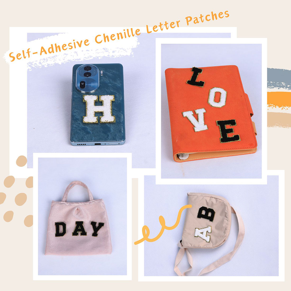
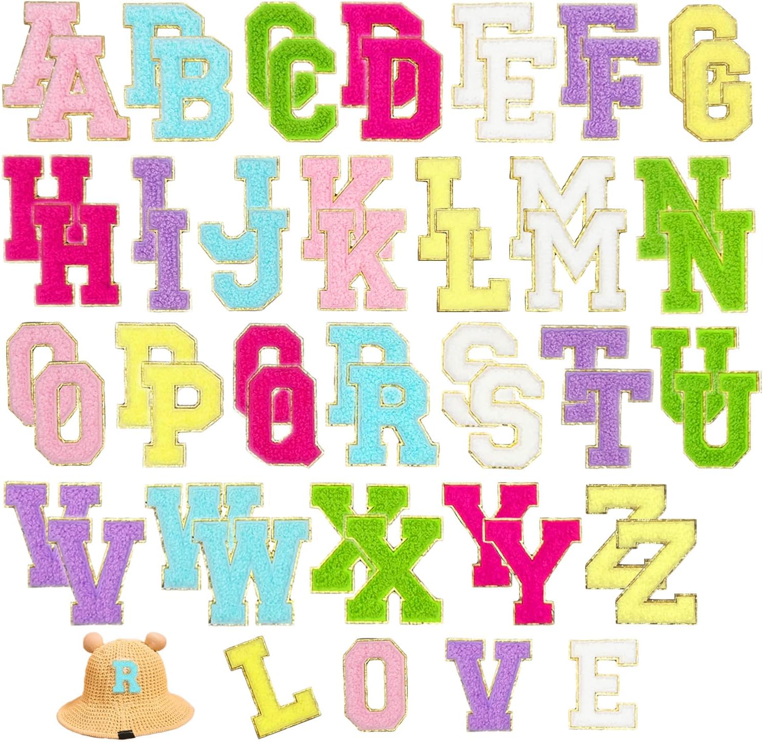
I’ve ironed a few hundred of these for myself, for gifts and for orders, and the same handful of mistakes shows up every single time. None of them is the patch’s fault. Here are the five I see most, each with the two-minute fix.
1. Too many letters
A name plus a class year plus three initials plus a number. That’s a team kit, not a look. The fix is boring but it works: pick one idea per garment. One initial on a chest. One name on a tote. One year on a cap. The restraint is what makes it read as designed.
2. Low contrast
Cream on tan. Red on red. The letter is there, technically, but nobody can see it. Fix: contrast you can read across the room, and match the letter to the panel it sits on, not the whole outfit. A letter on a navy pocket of a multicolour jacket needs to fight the navy, not blend with the jacket’s other colours.
3. Crooked
You don’t notice it while ironing. You notice it in every photo for the next five years. Fix: mark the spot with tailor’s chalk, centre it, level it against a seam, and press. A crooked letter is the difference between “custom” and “oops.”
4. Ironing the gold trim directly
The metallic gold edge is the detail that makes these look premium. Press the iron straight onto it and you flatten that fuzz into a sad, shiny line. Fix: always press through a thin cotton cloth. The heat still gets through; the trim keeps its dimension. This one trips up nearly everyone the first time.
5. Placing on a curve or a seam
Over a zip, a thick seam, a padded area, a rounded shoulder — the corners lift within one wash. Fix: flat, unreinforced fabric only, clear of zips, seams and padding. If the only good spot is curved, that spot isn’t good. Move it.
The bonus mistake nobody admits
Covering the whole back with a wall of letters because “more is more.” It isn’t. A packed panel reads like a clearance rack, not a design. The patches that get compliments are the restrained ones — one idea, well placed, well contrasted. Spend your letters like you mean it, not like you’re clearing stock.
Frequently asked questions
What is the most common letter-patch mistake?
Too many letters on one garment: a name plus a year plus initials plus a number. That reads as a team kit, not a style. The fix is to pick one idea per garment — one initial, one name, or one year — and leave the rest of the fabric alone.
Why does my letter look invisible even though it’s ironed on?
Low contrast. A cream letter on a tan base, or red on red, is technically there but unreadable. Match the letter to the panel it sits on, not the whole outfit, and make sure you can read it from across the room.
How do I keep a letter patch from looking crooked?
Mark the spot with tailor’s chalk, centre it against a seam, and level it before you press. A crooked letter reads as a mistake in every photo. Taking thirty seconds to align saves years of regret.
Why does the gold trim on my patch look flattened?
You pressed the iron directly onto it. The metallic edge is what makes these look premium, and direct heat squashes the fuzz into a flat line. Always iron through a thin cotton cloth so the trim keeps its dimension.
Why do the corners of my patch lift after washing?
It was placed on a curve, a seam, a zip or a padded area. Those spots flex and the corners peel. Use flat, unreinforced fabric only, clear of zips, seams and padding, and the corners stay down.
Is it good to cover a whole panel with letters?
No. A wall of letters reads like a clearance rack, not a design. Restraint is what makes a patch look expensive. One idea, well placed and well contrasted, gets far more compliments than a packed panel.
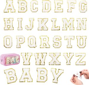
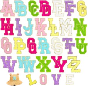
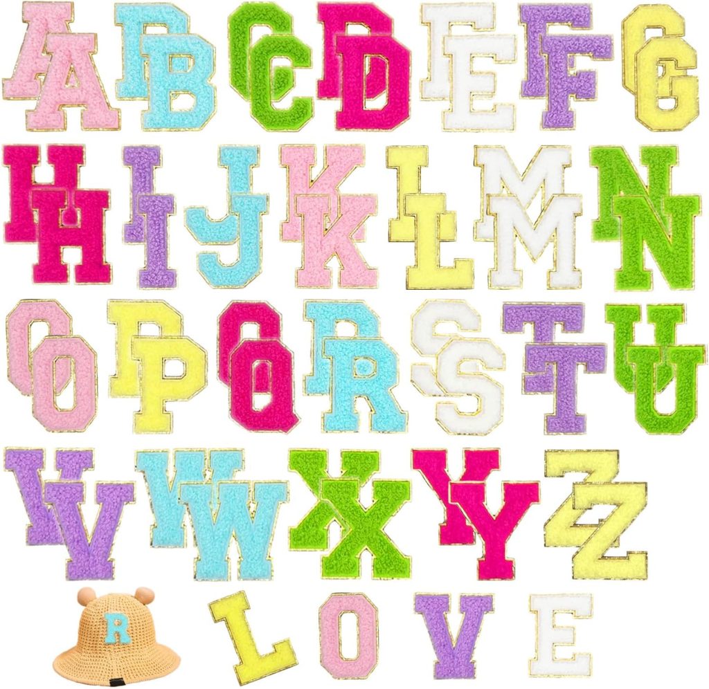
Shop the A–Z chenille letter sets
Every set is dense dimensional chenille with a metallic gold embroidered border, a strong self-adhesive backing, and an iron-on layer for permanence. Pick the size that fits your project.
Related reading
- Colour Combination Guide — fix low contrast for good
- 5 Style Recipes — the looks worth getting right
- Mixing Chenille with Other Elements — what actually holds up
- Per-Garment Formulas — pick the right flat spot
- Varsity letter guide — placement, size and spacing, the boring rules that save you
- All chenille letter sets — the four colourways side by side
- Letter layout previewer — see your name at true 2.17-inch scale before you buy
- The complete application guide — every fabric, every method, every mistake avoided
- Preppy letter-patch style — the Ivy League look, decoded
- Creative placement ideas — fourteen spots past the obvious chest