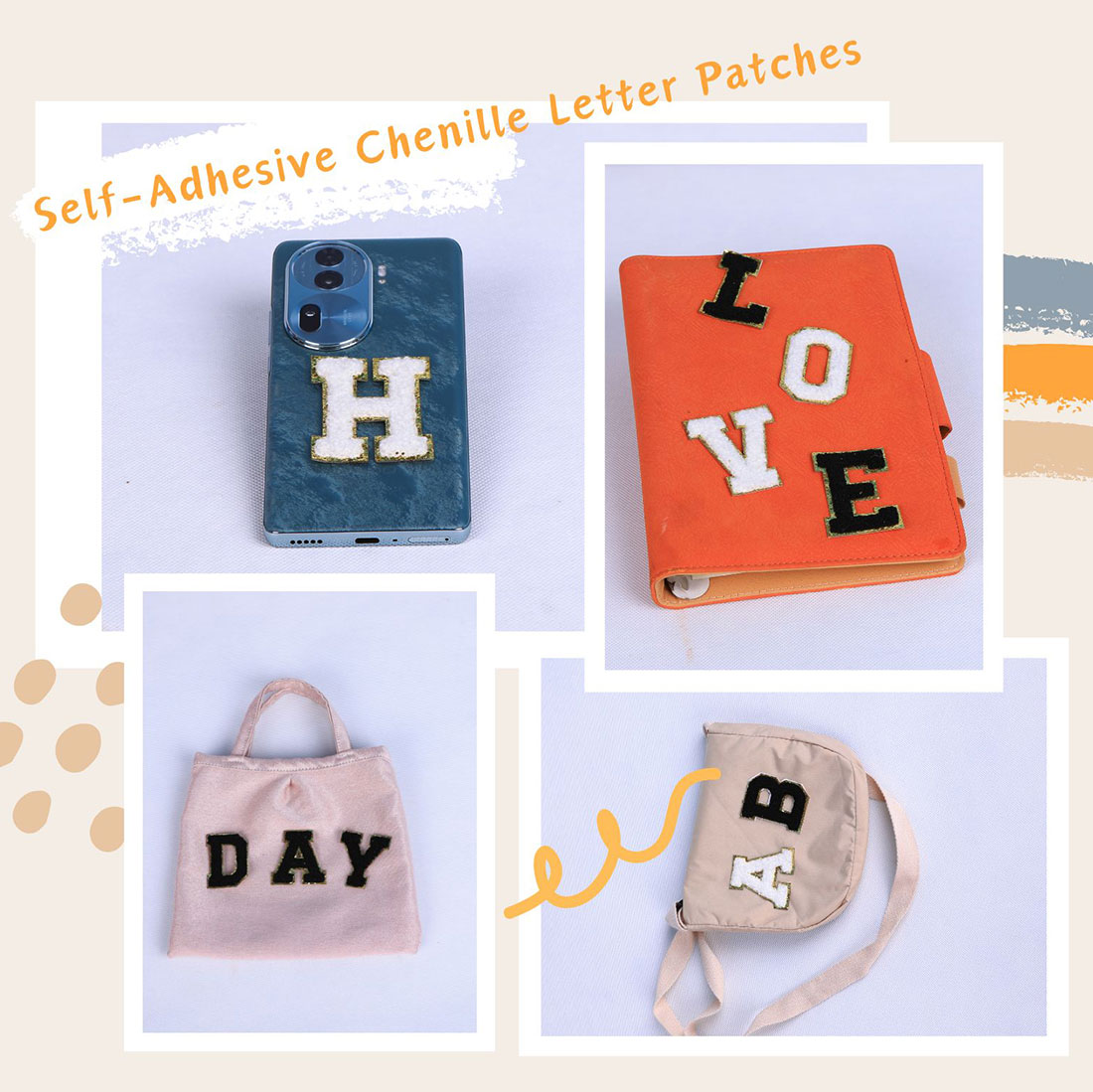
Preppy gets all the attention, which is exactly why it’s the easiest look to get wrong — everyone copies the same navy-blazer formula and it starts to read like a costume. Here are five letter-patch recipes I actually use, ranked from quiet to loud. None of them needs more than one box of letters.
1. The Quiet One (minimalist)
One initial, tonal or near-tonal, on a clean chest. That’s the entire recipe. The point is restraint: I would rather see one perfect “K” than a name, a class year and three numbers fighting for space. A white letter on a cream sweater, or a black letter on a charcoal tee, reads as expensive precisely because it’s doing less. This is the look I give people who say they “don’t do patches.”
2. The Collegiate (preppy, done right)
Navy blazer, white Oxford, single white initial on the left chest above the pocket, gold trim if you like. Keep it to one letter. The place people tip into costume is the sleeve monogram — suddenly it’s a team kit instead of a look. One initial, centred, level. Done.
3. The Streetwear Drop
Oversized hoodie, one big letter or a two-letter initial dead centre on the chest, neutral base with a single colour pop. The rule that separates a fit from a flea market: one loud element. A hoodie with a giant letter AND a cap initial AND sleeve numbers is a uniform, not a style. Pick the letter, shut up, walk out.
4. The Vintage Mix
Denim or canvas, a chenille initial anchored by one or two small embroidered florals, placed slightly off-centre on purpose. The charm is that the eras don’t quite match — a fuzzy modern letter on a worn-in jacket. Don’t centre it perfectly; a hair off reads as “found it in a thrift store,” which is the whole vibe. Over-centring makes it look printed.
5. The Family Echo
Parent’s tote and kid’s onesie in the same initial and colour, but not the same placement. The parent gets the name on a tote front; the kid gets the initial on a chest. Subtle match beats twinning every time — identical placement across ages reads as a corporate uniform, and nobody wants that in a family photo.
The through-line
Every recipe above shares one habit: decide the letter, the colour and the spot before you heat anything, and then don’t add a second idea. The letters that look “expensive” are almost always the ones that look like they were the only plan.
Frequently asked questions
What is the easiest letter-patch look to get right?
The minimalist one: a single initial in a tonal or near-tonal colour on a clean chest. No spacing maths, no second idea to balance. It reads as intentional precisely because it is doing less, and it suits people who say they don’t usually wear patches.
How do I do preppy without it looking like a costume?
Navy blazer, white Oxford, one white initial on the left chest, and then stop. The sleeve monogram is what tips preppy into costume. One letter, centred and level, is the whole look.
Can I mix a chenille letter with streetwear?
Yes, and it’s one of the strongest moves: an oversized hoodie with a single big letter or two-letter initial centre chest. The discipline is one loud element. A giant letter plus a cap initial plus sleeve numbers reads as a team kit, not a fit.
How do I make a letter patch look vintage rather than new?
Put a chenille initial on worn denim or canvas with one or two small embroidered florals, placed slightly off-centre on purpose. Don’t centre it perfectly; a hair off reads as thrifted, which is the charm. Over-centring looks printed.
How should a family coordinate patches without twinning?
Use the same initial and colour but different placements: the parent’s name on a tote front, the child’s initial on a chest. Subtle match beats identical twinning, which reads as a corporate uniform in photos.
What is the common mistake across all these styles?
Adding a second idea. A letter plus a name plus a year plus a number is a kit, not a look. Decide the letter, colour and spot before you heat anything, then don’t add to it.
Shop the A–Z chenille letter sets
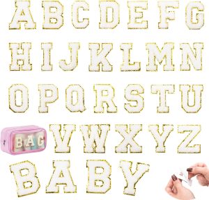
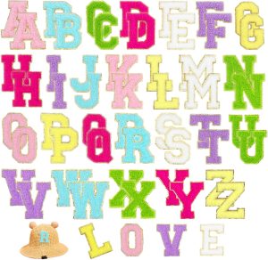
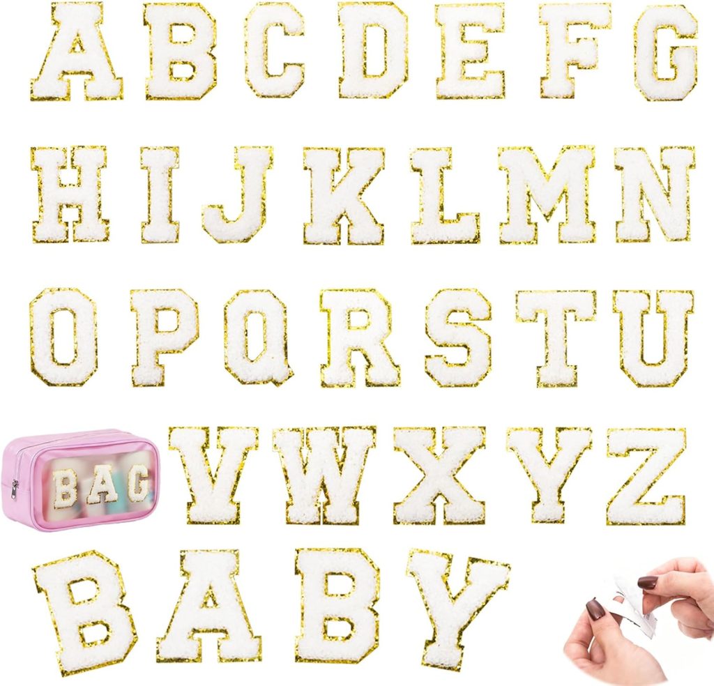
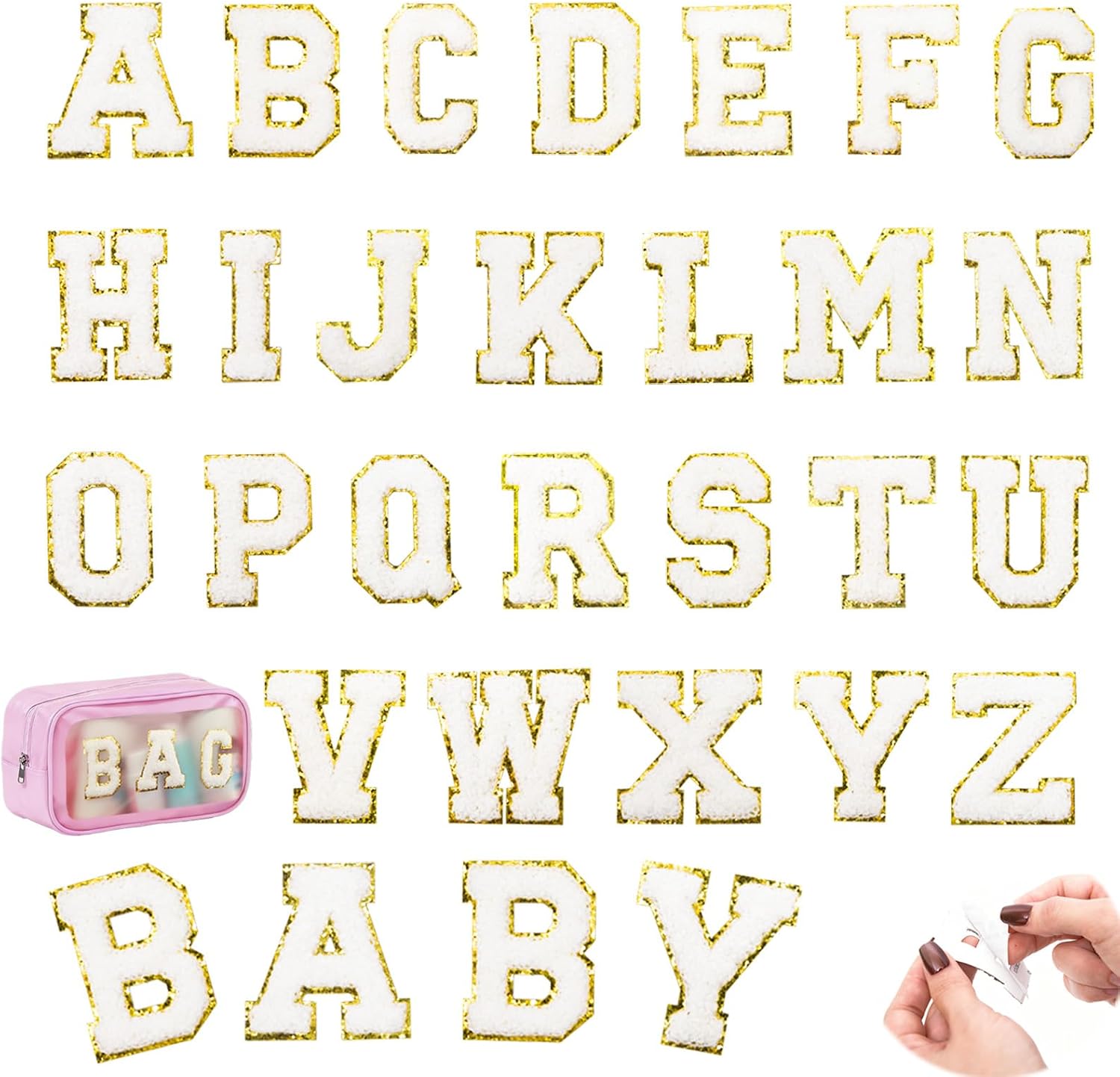
Every set is dense dimensional chenille with a metallic gold embroidered border, a strong self-adhesive backing, and an iron-on layer for permanence. Pick the size that fits your project.
Related reading
- Colour Combination Guide — what base plus what letter works
- Mixing Chenille with Other Elements — beyond the single letter
- 5 Ways Patches Go Wrong — and the two-minute fix for each
- Per-Garment Formulas — where each item actually works
- Varsity letter guide — placement, size and spacing, the boring rules that save you
- All chenille letter sets — the four colourways side by side
- Letter layout previewer — see your name at true 2.17-inch scale before you buy
- The complete application guide — every fabric, every method, every mistake avoided
- Preppy letter-patch style — the Ivy League look, decoded
- Creative placement ideas — fourteen spots past the obvious chest