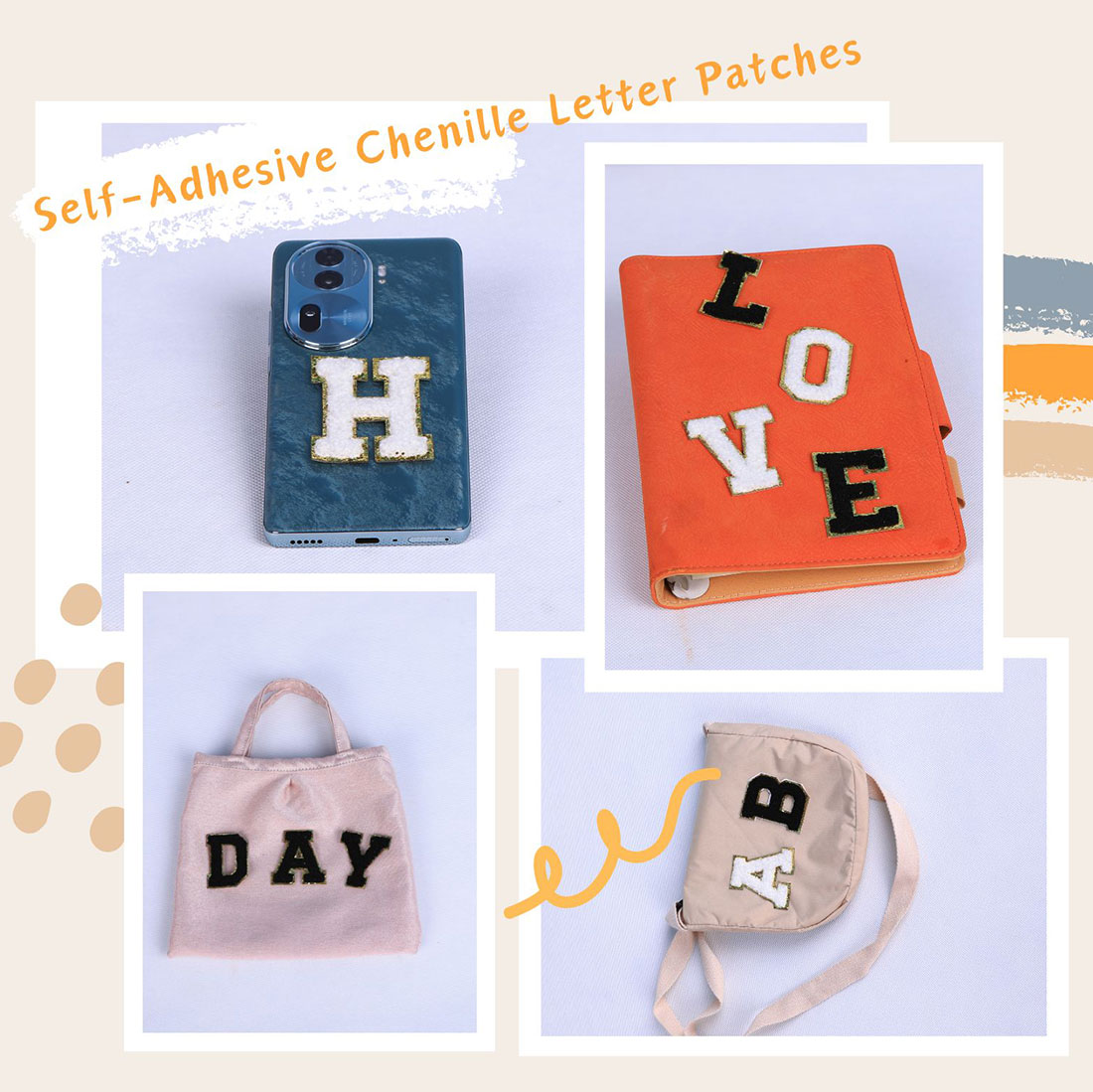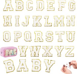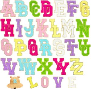
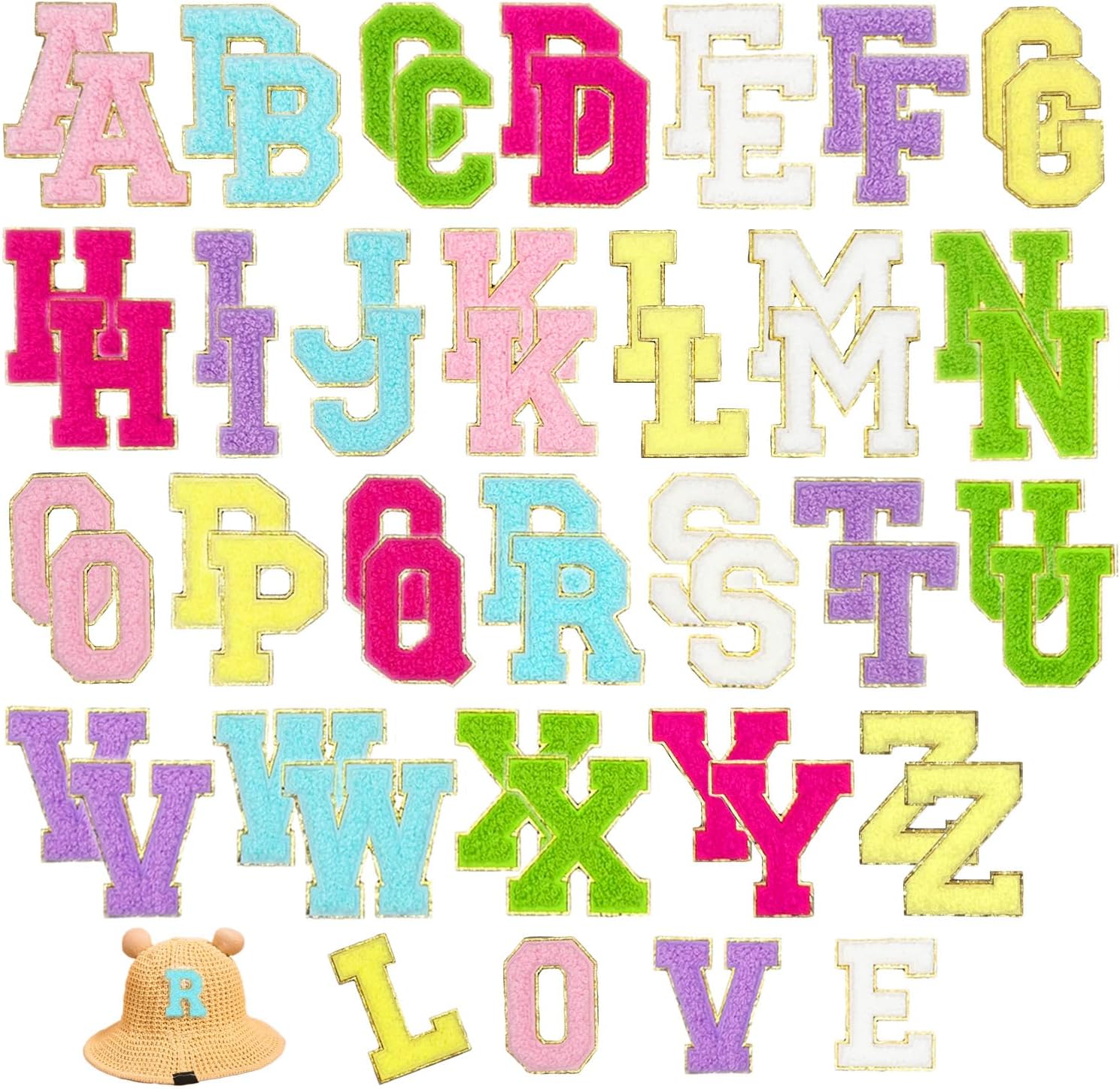
Most people choose a letter colour because they like it, then iron a cream letter onto a tan tote and ask why it disappeared. Colour matching a patch is not about taste — it’s about contrast you can read from across the room. After ironing a few hundred of these, I’ve landed on a short list of combos that just work, and a couple of trendy ones I’d think twice about.
The only rule that matters
Forget the trend reports for a second. If you can’t read the letter at three metres, the combination failed — full stop. Everything else below is just a shortcut to that one outcome. Light base, dark letter. Dark base, light letter. Mid-tone base, a letter at the far end of the contrast scale. That’s the whole theory; the rest is picking which dark and which light.
Combos I keep coming back to
| Your base | Letter colour that works | Why |
|---|---|---|
| Navy | White, or white with gold trim | The highest-contrast classic there is |
| Black | White, gold — or one red / neon pop | A single colour pop is the move people miss |
| White / cream | Navy or black | Never white-on-white; it just vanishes |
| Denim (mid blue) | Cream, white, mustard | Avoid blue-on-blue — it reads as a stain |
| Earth tone (olive / sand / rust) | Cream or off-white | I find cream cleaner than gold here |
| Pastel | A neutral: navy or white | A louder pastel on a pastel just muddies |
The tonal trend — and where it bites
Black-on-black and grey-on-grey are everywhere in premium streetwear right now, and they look fantastic in the photos. But here’s the catch nobody says out loud: that look only works because the chenille is fuzzy. The texture, not the colour, is what makes the letter visible. On a flat woven patch, black-on-black is simply invisible. So if you go tonal, keep the rest of the outfit quiet and let the pile do the talking — don’t also throw a busy print into the mix.
Match the letter to the panel, not the outfit
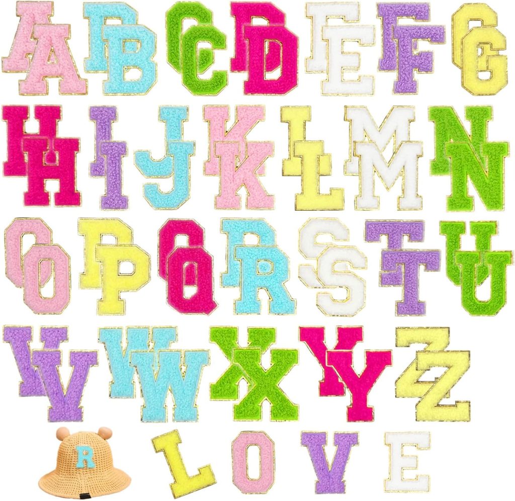
This is the mistake I see most. Someone has a multicolour jacket with one navy pocket, slaps a navy letter on that pocket, and it disappears — because they matched the outfit, not the panel the letter actually sits on. Always tune the letter to the specific fabric square it lands on. It’s the single reason I point people at the 52-piece multicolor set: two of every letter in five colours means you can re-colour the same initial for a navy tote, a white tee and a black cap without buying three boxes.
What I’d skip
- Same-family close tones. Tan letter on a beige tote. It’s a ghost.
- Red letter on a red hoodie. Even a “different” red rarely separates.
- Busy printed base under a small letter. A floral dress eats a 2-inch letter alive.
Frequently asked questions
How do I know if a letter colour will be readable?
Use the three-metre test: if you cannot read the letter from across a room, the contrast is too low. Light base needs a dark letter, dark base needs a light one, and a mid-tone base needs a letter at the far end of the contrast scale. Match the letter to the panel it sits on, not the whole outfit.
What is the safest letter colour combination?
White (or white with gold trim) on navy, and navy or black on white or cream. Those two pairings read at a distance on almost any garment and they are the ones I reach for first.
Does black-on-black actually work?
Only because chenille is fuzzy. The raised pile catches light and makes the letter visible through texture, not colour. On a flat patch, black-on-black is invisible. If you go tonal, keep the rest of the outfit quiet so the texture can carry it.
What letter colour goes on denim?
Cream, white or mustard read best on mid-blue denim. Avoid a blue letter on blue denim — it looks like a stain rather than a design. A gold-trim letter also pops nicely against the weave.
Which set should I buy if I patch different coloured garments?
The 52-piece multicolor set. It has two of every letter in five colours, so you can pick a white letter for a navy tote, a navy letter for a white tee and a black letter for a cap from one box, without running out of common letters.
Should the letter match the whole outfit or just the panel?
Just the panel. A multicolour jacket with a navy pocket needs a contrasting letter on that navy pocket, not a letter that matches the jacket’s other colours. Tuning the letter to its actual fabric square is what keeps it readable.
Shop the A–Z chenille letter sets
Every set is dense dimensional chenille with a metallic gold embroidered border, a strong self-adhesive backing, and an iron-on layer for permanence. Pick the size that fits your project.
Related reading
- 5 Style Recipes — from quiet minimalist to loud streetwear
- Mixing Chenille with Other Elements — what holds up, what doesn’t
- 5 Ways Patches Go Wrong — and the two-minute fix for each
- Per-Garment Formulas — denim, hoodies, totes, caps, sneakers
- Varsity letter guide — placement, size and spacing, the boring rules that save you
- All chenille letter sets — the four colourways side by side
- Letter layout previewer — see your name at true 2.17-inch scale before you buy
- The complete application guide — every fabric, every method, every mistake avoided
- Preppy letter-patch style — the Ivy League look, decoded
- Creative placement ideas — fourteen spots past the obvious chest
Chenille Letter Patches Gold vs White: Which Trim Wins?
The most common colour question we get is chenille letter patches gold vs white — and the honest answer depends on what you are putting them on. Gold trim reads warm and collegiate, and it looks its best on navy, black, forest green and burgundy. White trim is cleaner and more modern, and it pops hardest on light denim, tan canvas and heather grey.
The quick test: hold the patch against the garment in daylight and look at the letter body, not just the border. If the base and the letter are within two shades of each other, the gold edge is usually what keeps it readable. If you are still undecided, the layout previewer shows both colourways on the same garment side by side.