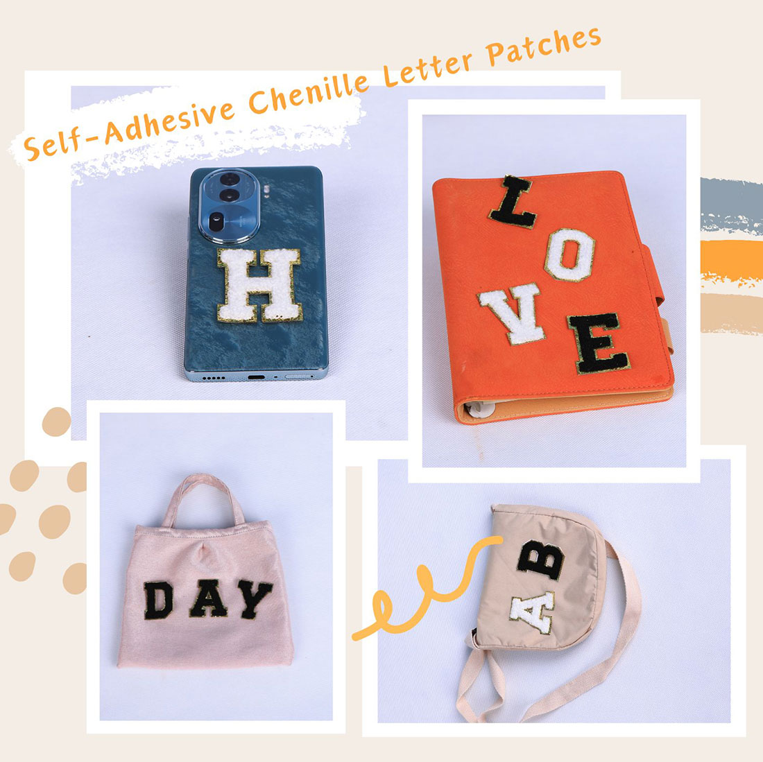
A single letter is a statement. Two kinds of patch is a composition. Three is where it gets dangerous. People ask me how to “mix” chenille with other elements, and the honest answer is: most of the cool-looking ideas in photos are a pain in real life. Here’s what actually holds up.
Chenille + small embroidered accents (the safe winner)
This is the pairing I recommend most. A chenille initial anchored by two or three tiny embroidered florals reads as “curated” rather than “craft project.” The rule: keep the embroidery small and few. A spray of six flowers around one letter looks like a sample book; two well-placed ones looks like a decision.
Chenille + a distressed knee or frayed edge
Genuinely good. The fuzzy raised letter sitting next to a frayed denim edge is a nice texture conversation — soft against rough. Put the letter near the rip, not on it; a patch over a hole flexes every time you bend and the corners lift. Beside the distress, it stays flat and the contrast does the work.
Chenille + pins, studs, grommets (skip it)
Looks amazing in a flat-lay photo, terrible in a week of real wear. Metal snags chenille loops and you end up with a letter that’s quietly unravelling. If you absolutely want hardware, keep it well away from the letter and accept that it’s a look for photos, not for the washing machine.
Chenille + a busy printed base
Only if the letter is high-contrast and large. A small letter on a floral dress or a bandana print gets eaten alive — the eye can’t find it. If the base is loud, the letter has to be louder and bigger, or move it to a plain panel (a pocket, a strap) where it can breathe.
Mixing patch shapes
A round chenille letter beside a rectangular name patch can work if they’re aligned on a common baseline. Mismatched sizes with no alignment look accidental, not artistic. I align everything to one invisible line and call it done — your eye does the rest.
The sample-book trap
More than three element types on one garment — letter, floral, stud, print, woven label — and it stops being a design and starts being inventory. I cap myself at two. The letters that get compliments are almost never the busiest ones.
Frequently asked questions
What mixes well with a chenille letter patch?
Small embroidered accents are the safe winner: a chenille initial anchored by two or three tiny florals reads as curated. A distressed denim edge beside the letter also works well, as long as the patch sits near the rip rather than over it.
Can I add studs or pins next to a chenille letter?
I’d skip it for wear. Metal snags chenille loops and the letter slowly unravels. It can look good in a photo, but in real washing-machine life the hardware and the fuzz don’t get along. If you must, keep metal well away from the letter.
Will a letter patch work on a printed or floral base?
Only if the letter is large and high-contrast. A small letter on a busy print gets visually eaten. Either go bigger and bolder, or move the letter to a plain panel like a pocket or a strap where it can breathe.
How do I combine different patch shapes without it looking messy?
Align them to one common baseline. A round chenille letter beside a rectangular name patch works when both sit on the same invisible line; mismatched sizes with no alignment look accidental rather than artistic.
How many element types is too many on one garment?
Three. A letter plus a floral plus a stud plus a print stops being a design and starts being a sample book. I cap myself at two element types; the patches that get compliments are rarely the busiest ones.
Should I layer a patch on top of another patch?
No. Stacking patches traps heat and lifts corners, and it reads as a mistake. Flat fabric first, always — put the second element on a different panel rather than on top of the first.
Shop the A–Z chenille letter sets
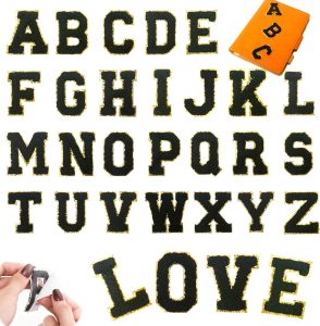
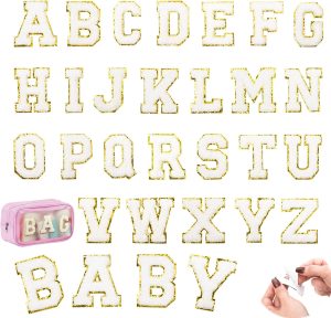
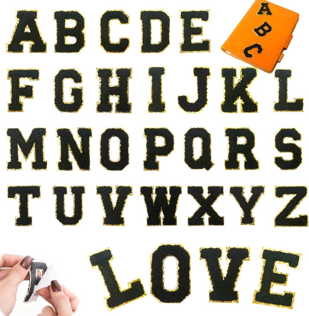
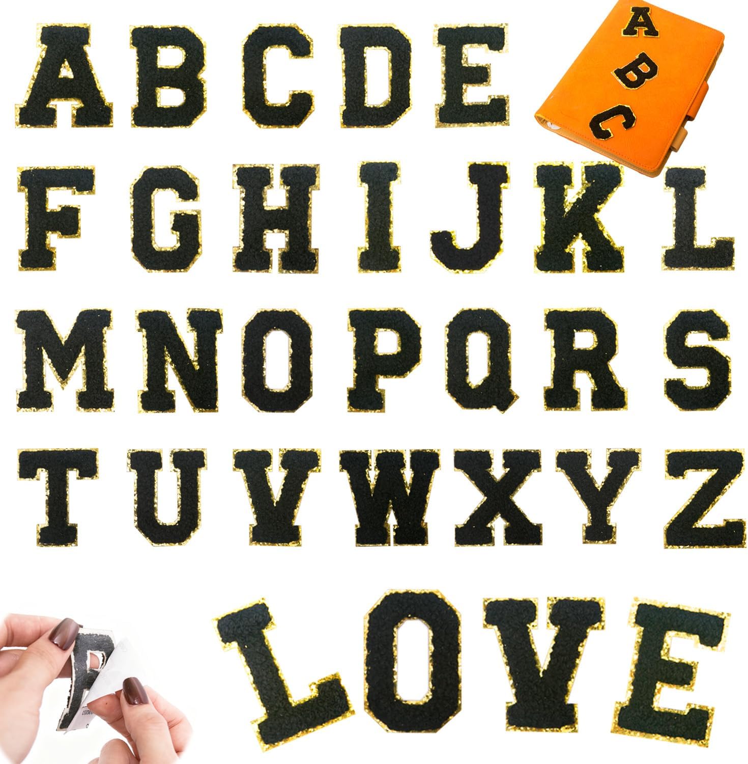
Every set is dense dimensional chenille with a metallic gold embroidered border, a strong self-adhesive backing, and an iron-on layer for permanence. Pick the size that fits your project.
Related reading
- Colour Combination Guide — contrast you can read across the room
- 5 Style Recipes — from quiet to loud
- 5 Ways Patches Go Wrong — and the two-minute fix for each
- Per-Garment Formulas — denim, hoodies, totes, caps, sneakers
- Varsity letter guide — placement, size and spacing, the boring rules that save you
- All chenille letter sets — the four colourways side by side
- Letter layout previewer — see your name at true 2.17-inch scale before you buy
- The complete application guide — every fabric, every method, every mistake avoided
- Preppy letter-patch style — the Ivy League look, decoded
- Creative placement ideas — fourteen spots past the obvious chest