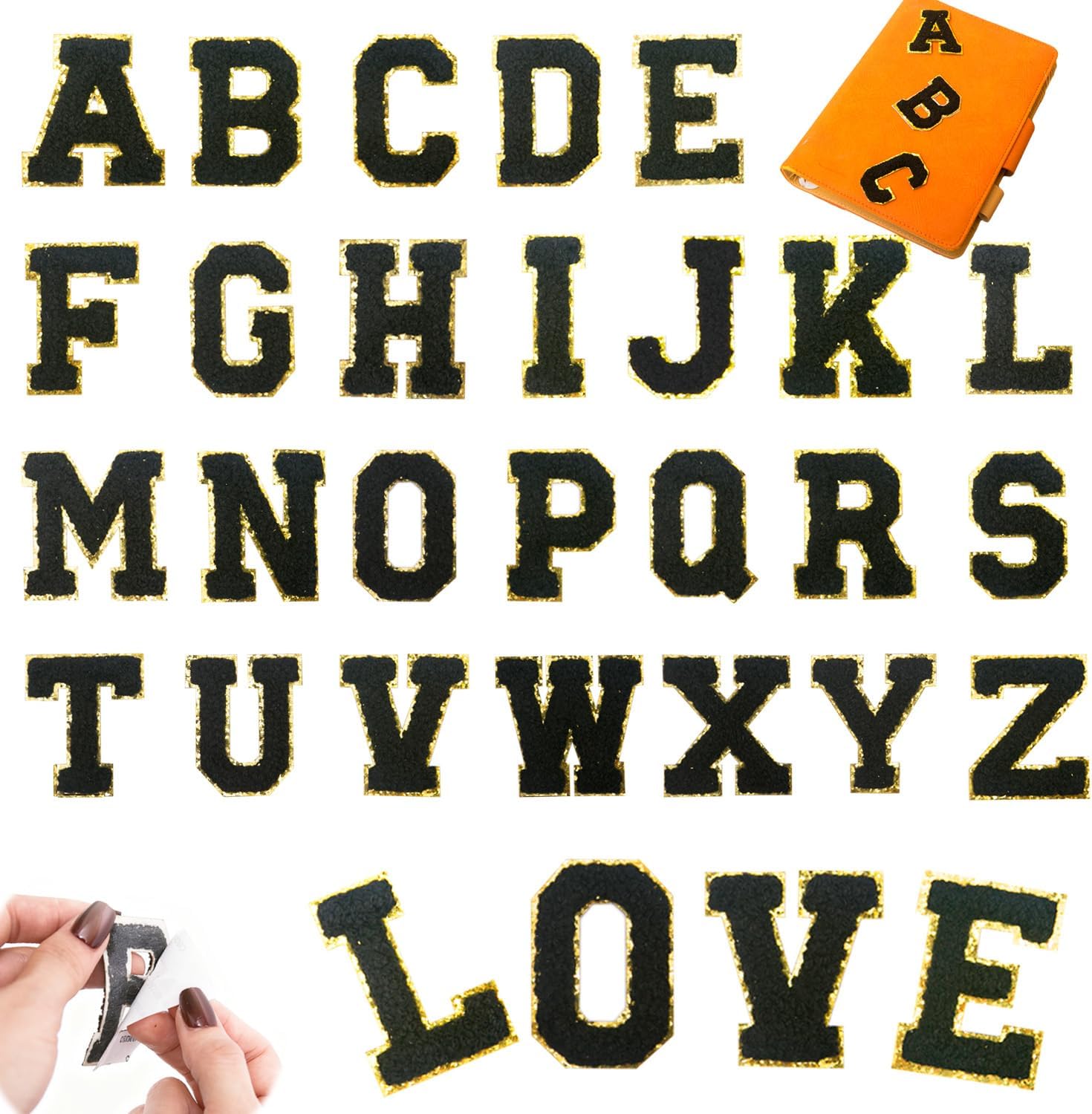
A cap is the cheapest personality upgrade you can make: one bold initial on the front and a forgettable hat becomes yours. I have done this for gifts, for teams, for a friend who lost his only labelled cap — it never misses. The catch is that a cap front curves, and that curve is where beginners scorch the trim or lift a corner. Do it the way below and it is a five-minute job.
One bold initial, front and centre
Resist the urge to spell a whole word across a cap. The front panel is small and curved; a single initial reads clean and expensive, a full word looks cramped and homemade. If you must do two letters, keep them as a monogram (first, last, middle) tight together — never a stretched name.
Why the front panel beats the side
The side panels are smaller and curve more, so letters there look like an afterthought. The front panel is the flattest, most visible part of the cap and it is where a monogram is expected. That is where the eye goes, so that is where the letter goes.
Size and count
At 2.17 inches a single YTONN letter sits clean on a standard cap front with room to breathe. Two letters work as a monogram if you butt them together. Anything more and you are fighting the curve. For a cap, a 26-piece set in the cap’s contrasting colour is all you need — one initial, one colour.
The curvature warning
The front panel bows outward, so when you press you are heating over a dome, not a flat board. Two things follow: press through a cloth (the gold trim scorches fast on a cap because the iron wraps around the curve), and hold the iron still rather than sliding, or you drag the letter off-centre. I also give the corners an extra second of pressure so they seat on the curve instead of lifting later.
Fabric: cotton twill, not mesh
A cotton or wool-blend twill cap is ideal — flat enough, sturdy enough. The mesh back of a trucker cap is a no; the holes and the curve together guarantee a lifted corner. Foam-front “snapback” panels are fine if they are fabric-faced, but skip anything with a hard plastic front.
Application, cap version
Peel the backing, centre the letter on the flat part of the front panel, hold it a few seconds so the adhesive grabs. Cover with a thin cotton cloth and press a warm iron still (no sliding) for about ten seconds, paying a little extra attention to the corners. Let it cool before you flex the cap. The full, fabric-by-fabric method is in the application guide — read the cap note before your first one.
Mistakes on caps
- Scorching the gold trim. The number-one cap error. Always press through cloth, never direct.
- Sliding the iron. On a curve that drags the letter. Press still.
- A full word. Looks cramped. One initial, or a tight monogram.
- Mesh back. Lifts. Use the twill front only.
Frequently asked questions
Can you put letter patches on a baseball cap?
Yes, and a single initial on the front panel is the cleanest cap upgrade there is. Use the flat twill front, not the mesh back, centre one letter, and press through a cloth because the curve makes the gold trim scorch easily.
How many letters fit on a cap?
One initial reads best. Two letters work as a tight monogram; a full word looks cramped on the small curved front. At 2.17 inches a single letter sits clean with room to breathe.
Will a letter patch stay on a hat?
On a cotton or wool twill front, yes, if you press it properly through cloth and give the corners extra pressure to seat on the curve. On a mesh back or a hard plastic front it will lift, so use the fabric front panel only.
Is self adhesive or iron on better for caps?
Self-adhesive. The glue holds the letter centred on the curve while you heat, so it will not slide as you press — which is exactly the cap mistake people make with pure iron-on. The iron step then locks it.
Can I wash a cap with a letter patch?
Hand-wash or use a cap cage on cold, and keep the iron off the trim. The patch survives; the foam and the letter both dislike heat and agitation, so gentle is the rule.
What size letter patch for a cap?
About 2.17 inches, which is the YTONN size. It fills the front panel without crowding the seams. Bigger overpowers the cap; smaller looks lost.
Should the letter go on the front or the side of a cap?
The front panel. It is the flattest and most visible part and it is where a monogram is expected. Side panels are smaller, curve more, and make a letter look like an afterthought.
Shop the A–Z self-adhesive chenille sets
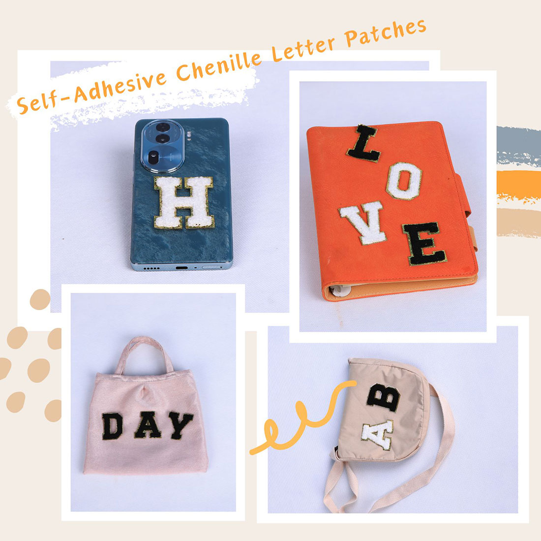
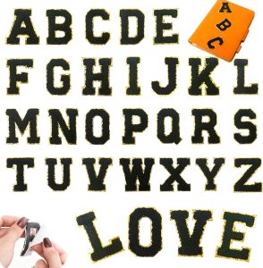
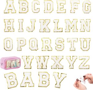
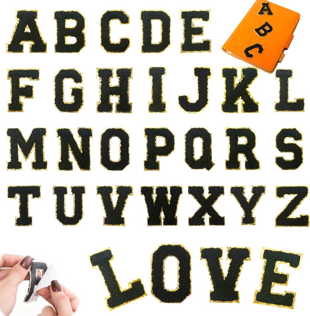
Dense dimensional chenille with a metallic gold embroidered border, a peel-and-stick adhesive backing, and an iron-on layer for permanence. Pick the set that fits your project.
Related reading
- Letter patches for clothes — the umbrella guide
- Letter patches for bags — totes and backpacks
- Letter patches for jackets — varsity placement
- Letter patches for jeans — pocket and hem
- Letter patches for hoodies — chest and sleeve
- Self-adhesive chenille sets — the peel-stick-press A-Z set
- Letter patch types & uses — chenille vs embroidered vs iron-on
- All chenille letter sets — the colourways side by side
- The complete application guide — every fabric, every method
- Per-garment formulas — denim, hoodies, totes, caps, sneakers
- Creative placement ideas — fourteen spots past the chest
- Varsity letter guide — placement, size and spacing
- Preppy letter-patch style — the Ivy League look, decoded
- How to decorate clothes with patches — a starter walkthrough
- Colour combination guide — what base plus what letter reads